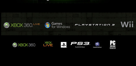
One of the more interesting announcements related to the PlayStation 3 Slim was the fact that Sony is re-branding it. Up until this point Sony's shiny black box sported a Spider-Man the movie font with the word PlayStation 3 all spelled out. This was a departure from the previous two boxes which both sported PS and PS2 logos.
Now Sony has officially replaced that logo with a PS3 and has asked all marketing material be updated. The reason behind this is actually a very simple one - because the old logo is so wide and short, when scaled it gets lost amongst the other system logos.
Talking of form and design, I see you’ve ditched the Spider-man typeface from the new PlayStation…
We wanted to make sure that we set a new direction for the PS3. The PS logo with the capital P and small S has always been our logo, has always been synonymous with video games and I wanted to reset the thinking. Also internally I wanted to send the message internally that we are resetting the thinking, going back to our roots. What better way to do it than by resetting the logo? That puts the entire organisation on its toes. On a practical level, when you have PlayStation 3 spelt out, the aspect ratio was such that if you wanted it on a billboard it became tiny. It didn't work in terms of visibility.
And now all is right in the world.
Source: Technology.timesonline.co.uk
